Your first MURAL Board | Step-by-Step
- Franziska Blickle

- 20. Okt. 2021
- 6 Min. Lesezeit
Aktualisiert: 24. Okt. 2024
This is the English version, for the German text please click here:
A click on one of the steps will take you there directly:
Step 1 | Create a new board
Step 2 | Create a sticky for size reference
Step 3 | Decide for a layout and position the areas
Step 5 | Add instructions and additional information to the areas
Step 6 | Use color and icons to set the mood
Step 7 | Create the outline
Step 8 | Change the design of your areas - if you want to
Step 10 | Check the order of your outline steps and hide them if you want to
Step 1 | Create a new board
As soon as you log in at mural.co, you are taken to your dashboard. This is where you find all your boards. In the upper left corner you will find the button "new mural".

A new window will open. Here you can give your board a name and select the storage location. You can then click on the “Create mural” button to create your board.

After the board opens, a new window pops up with “Add a Template”.
Don't let the proposed templates confuse you - we're starting on a blank board today!
Therefore close the window with the small cross at the top right.

Your board will now be created with the so-called “default settings”, i.e. with certain settings that you can change at any time later. Default settings:
Your board is faint white, is infinitely large and the avatars of the participants who join later are animals.

My advice:
Leave the settings as they are. If you want to change it right away, click on the little arrow next to the title of the board (first screenshot) and chose "MURAL settings".

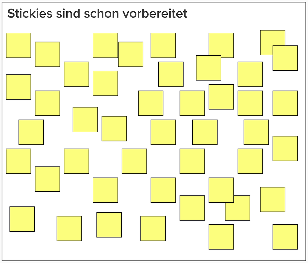
Step 2 | Create a sticky for size reference
In the beginning it is not that easy to get a feel for the proportions on the board. How big does an area have to be for a brainstorming session? How much space do we need for group work?
My advice:
First of all (!) I always put a sticky in the upper left corner, the size of which I do NOT change. This way I always have a reference size, my standard sticky so to speak.

Example:
15 participants, eyh writes down 3 ideas, we will need space for 45 stickies of my reference size.

Step 3 | Decide for a layout and position the areas
a) Decide for a layout
In the western culture we are used to "read" from the upper left to the lower right corner. Upper left could be a good starting point, but how do we continue?
These are some ideas to help you decide which might fit your needs:
Linear horizontal from left to right

Linear vertical from top to bottom

Several lines from the upper left to the lower right corner

Several lines, a header and a footer

Several lines with space on both sides

A "way" we follow on the board

My advice:
If you decide for this kind of path, arrows might be helpful guiding participants along.
Circle

Main area and other areas for information or activities around it

I'd rather not recommend this:
Random order only you as the creator can read

b) Position areas as placeholders where you need them
As soon as you decided for the layout, I suggest you create all the necessary areas and position them accordingly.
My advice:
During the creation and design process I set area settings to a dark grey color and a black border because it is easier to see them. If I don't like that color for my workshop I change it in step 8.

How do I know how many areas I need?
My advice:
Go through your workshop or meeting and count how many areas you will need to show , to explain or to work on s.th.
Check if you need more than one area for group activities.
Think about having additional areas for check in, agenda, ground rules, Q&A, summary, next steps or to present files.
Step 4 | Add titles and structure to the area
a) Titels
Add logical titles to your areas, which do not only tell you what this is about but all participants as well. It might also be helpful tu add a number.
"Talking titles" and numbers bring a lot of orientation and prevent people from asking "Where are we and what do we actually do?".
My advice:
I pick a font size for title and number that is still visible if I zoom out all the way out and can see the whole board.

Arrows showing the direction of the next step are very helpful for participants.

b) Structure
Go through all the areas now:
Do you need an empty space for this activity or is helpful to have stickies already?
Maybe lines or frames help to make good use of the given space?


Now is also the time to check if the frameworks offer a nice illustration or ready to use template to replace the empty area...

My advice:
Keep it simple! Use "Shapes & Connectors to create simple lines or frames. As simple as possible and as structured as necessary. If you can not think of a helpful structure, you probably wont't need one. Less is more!
Step 5 | Add instructions and additional information to the areas
a) Instruction
Go from area to area and add your questions or instructions. All that you explain should be there (maybe bullet points are enough). Specific questions you want them to answer should be here in full.
b) Additional information?
For example you could add:
the time they have for this activity...
a hint on the pop up trick ("Hold X and hover over elements to see them from far away.")...
Bonus tasks for super fast groups...
reminders how the content is added ("double click = sticky") ...
In this example you find the whole task in the box at the upper left and additional information on the upper right side:

Step 6 | Use color and icons to set the mood
If you want to, you can now add images, icons, logos or colorful splashes to your board. From serious to funny, it will help you set the mood.

Using the search bar for icons and scroll a little further will pay off !
This is how you can find similar icons and find your own style.


Step 7 | Create the outline
Now is the time to decide which areas go into the outline as single steps.
My advice:
This is what I put in the outline:
A) all areas I want wo be able to address with the navigation function of the outline.
B) all areas I want to hide first and reveal later.


In this example I am hiding the single questions and will reveal them one by one.
Step 8 | Change the design of your areas - if you want to
If you want to change the design of your areas, now is the time..
Grey but without the border?
Different colors?
Maybe even without a color or border to make them invsible?
On my activity board little islands are surrounded by an invisible rectangular area. I can use the advantages without them interfering with my design.

Step 9 | Lock everything that shall remain unchanged
The most important step in your preparation is locking all (all!) element, that should not be moved or changed by the participants.
You want all the frames, instructions, arrows, numbers to remain where they are, don't you? Lock them! Only stickies and items you want to be moved around should be locked!
Step 10 | Check the order of your outline steps and hide them if you want to
The very last step is to check the order of your outline steps. You can drag and drop them to any position to adjust.
If you want you can now hide areas in the outline. Bring your cursor over the outline step and click on the eye symbol that appears.

My advice:
The area is completely invisible, but you can read the title. If you are planning a surprise, maybe chose a title that only has a meaning to you or at least doesn't give anything away.

Yay! Done! What a ride!
Your board is ready to go!


Kommentare